
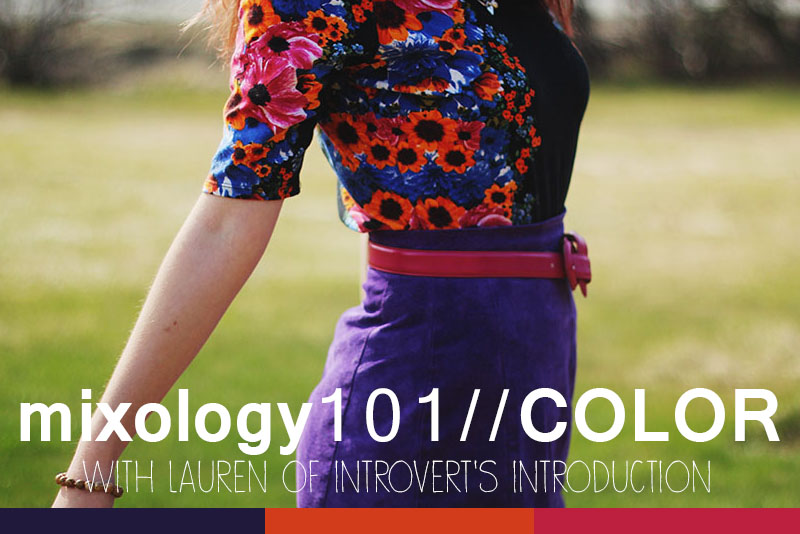
First of all, I must begin by saying that these are just my opinions and may or may not be textbook accurate. But from what I know and have experimented they are true and they work for me, so I hope they work for you!
Second of all, get rid of all notions that one color doesn't match with another, because it's not true. Because colors exist in nature, they are all harmonious with one another. Where people go wrong is in the amount of combinations of colors they wear. Today I'll be showing you some examples (a lot actually, because I couldn't bear to not include some of my favorite bloggers) of colors you may not think work well that actually do.
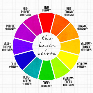 | When it comes to color, there's a vast amount of knowledge about the subject. You can read all about color on the internet, but one website I find especially helpful is this one. For now, we will start with the basic color wheel. These are the most basic colors, or hues, and from them come every color you see. Tints are the lightening of the twelve basic colors (think pastel colors). Tints are achieved by adding white to colors. Shades of colors are achieved when you add black (generally) to the twelve basic colors. (In painting, instead of adding black, you add the opposite color on the color wheel, i.e. add red to green to make the red darker, to not compromise the vibrancy of the red, but that's a different topic.) A tone is when you add grey to a color (think muted colors). Now remember, all colors go together. You can mix (and I mean mix in the sense of pairing two different pieces of clothing together) a tone with a shade with a tint, of any color, with any color. There are plenty of examples below where people have done this successfully. The general rule, however, is that a color in close relation to another will compliment it. For example, colors next to each other on the color wheel (called analogous), or those opposite each other (complementary) fit well together. But now let's look at some examples to see the colors in action. |
Connie from K is for Kani is the perfect contendor to begin with. I've long been a huge fan of her fun colors and she has an amazing knack to match things together. In this outfit specifically, you can see how she used complementary colors to her advantage. Her two main colors are both tones of red and green, opposites on the color wheel. She uses the yellow-orange tone as an accent color, which is in between both the red and green on the color wheel. Because she stuck with two main colors and an accent color, and because they were all tones, this color combination worked. | 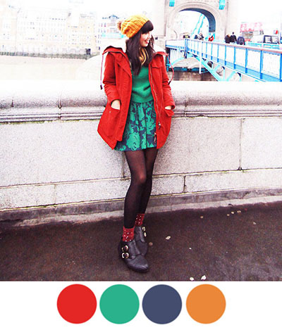 |
Question: How can I add more colors into my outfits easily?
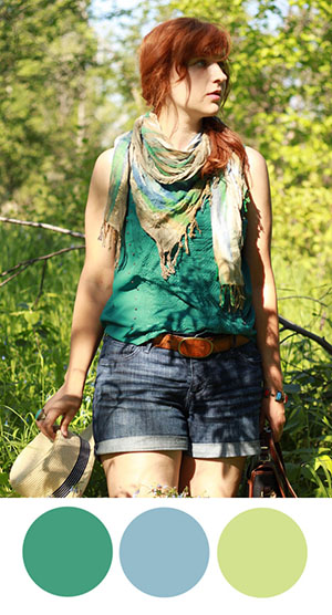
Olivia of La Voyageuse is a great example of incorporating many different colors into an outfit. If you're nervous about adding a lot of color to your wardrobe, start with one piece at a time. In this ourfit, Olivia had a multicolored scarf with greens and pinks and blues. For this outfit specifically, she chose to add to the pinks of the scarf with (a shade of) red shorts and (a tint of) red sweater, allowing the blue and green (which are analogous colors) to be her accent colors.
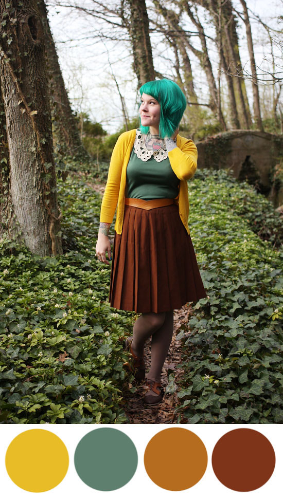
 | Similarily, Katie of Alaskan Weredork (left) used her scarf as the main focal point, pulling from the greens in the scarf to match her shirt. A way she could remix this scarf would be to pair it with a yellow or blue piece of clothing, since both tints are also in the scarf. Lauren of Someone like You used her neutral daisy romper as the main focal point, and a dark green as an accent color. This also brings up a good point about neutrals. Neutrals consist of browns, blacks (to include greys), white, and navys, and they go with any color (be it tints, shades, or hues) including other neutrals. (Whoever told you that brown and black don't go together was lying to you.) Because Lauren's romper consists of neutrals, she can pair any colored cardigan with it. Perhaps a red orange cardigan with a blue green belt (complementary colors)? | 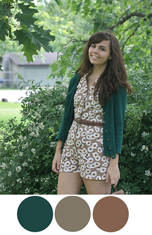 |
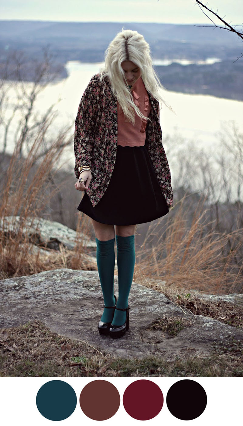
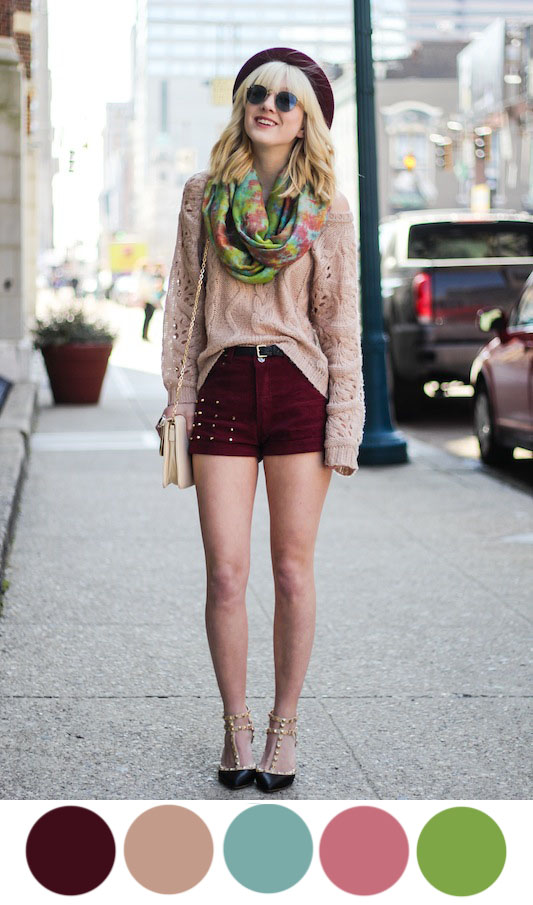
Hannah from Styles by Hannah Riles does an excellent job of showing how to pair shades of colors together. A beautiful maroon color next to a deep teal blue color is one of my personal favorite color pairings. In this case, because maroon is the most prominent color, the blue acts as a compliment. The tone of red also works because it is related to the maroon color. Even though they are two separate colors, they can be classified as one since they share the same hue: red.
 | If you hold your mouse over the left image, you can see how perfectly the two reds relate to each other. One is more of a tone, one is slightly closer to purple on the color wheel, but they both share the same shade (both have the same amount of black in them). It's important as a general rule to keep your outfit to one or two main colors with one accent color. |
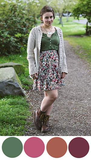 | Elanor of Missing Lovebirds (left) has the perfect outfit to showcase this rule. Her main color is this tone of green, with one accent color of red. The swatches of red that I have highlighted, of course, are in various tones and slightly different positions on the color wheel (some leaning towards red, and some leaning towards orange, but they are all derived from the hue red. Plus, it's easy to combine these reds because they are already together in one skirt. Elana of Room 334 (right) also has a similar skirt to showcase this concept. She took the tint of blue in the skirt, and went straight to its hue in the pairing of her necklace. | 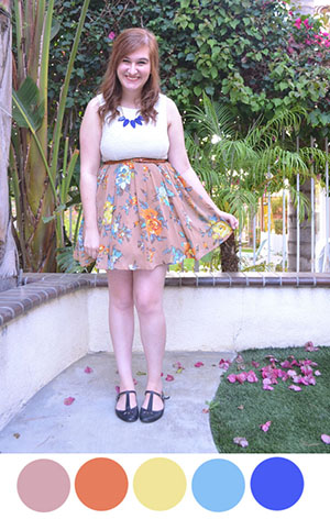 |
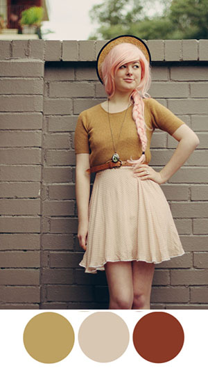

Some more examples include Annika of The Pineneedle Collective (middle), pairing neutrals with a tone of yellow and her pastel pink hair; Kaylah of The Dainty Squid with a beautiful earth toned (ie browns, greens) outfit with a yellow cardigan (which plays off of the yellow-orange in her neutral browns); and Jessi of Haircut and General Attitude in bright analogous colors of red (pink), orange, and yellow.
Despite what this post suggests, this isn't an exact science. You can't go around with an eyedropper tool to sample every color you come by, though that would be incredibly cool. I learned everything I know from trial and error, and mostly from just instinctively seeing what looks good together and what doesn't. It was only in preparing this post that I saw how refined color mixing actually is. But that doesn't mean you have to make it refined. In fact, I want you to break all the rules I just gave you and wear whatever colors you want! That's the joy about personal style: you wear what makes you happy. But as far as I know, these are the best guidelines to mix colors together for one cohesive, stylish look.
takeaways:
1. All colors go together. Some just happen to go together better than others.
2. Neutrals are your friend. Browns, blacks, whites, and navys go with any color, including other neutrals.
3. If you're looking to slowly incorporate color mixing into your outfit, go with a piece of clothing that features many colors.
4. Above all, experiment. Always keep an open mind to color. Some combinations may surprise you!
If you have any further questions on color or need clarification on anything I've talked about, please don't hesitate to ask! I will be happy to answer your questions and give you more examples and help you mix color in your own outfits.
Tomorrow we will be looking at patterns and how to mix them, so be sure to check back soon.
Have a great day!
No comments:
Post a Comment