
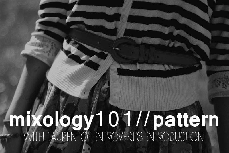
Today we are talking all about patterns! Every image on this post can be viewed in its original color when you hover your mouse over it. It is essential to look at the patterns without color to distract, but more often than not you will see how impactful color is to the success of wearing multiple patterns at one time. Today I will talk about combining patterns themselves, and tomorrow we will focus on both colors and patterns. Be sure to check out yesterday's post on mixing colors here.
The topic of patterns is a bit harder, not only because patterns include color, but also because there isn't as much of a science involved with patterns. But today we will focus on the patterns themselves.
When I was younger, I wanted to be an interior designer when I grew up. Even though I probably won't do that for a living, many things from interior design coincide with creating outfits. In fact, I don't think there's anything that isn't related between the two. This is a great article about mixing prints that you should definitely read (it's short!), and I will translate a few them to the clothing world.
 | A lot of people are nervous to mix prints together, and for good reasons. There's a fine line between a good mix and a bad one. One good thing to keep in mind is that like colors, there are neutral patterns. Polka dots and stripes are the two most basic patterns, and can be combined with any other pattern, including other neutral patterns. They are also great geometric patterns and work excellently with organic patterns like florals. Jo of Lost in the Haze (left) and Keiko of Keiko Lynn (right) both show this idea of neutrals. The stripes and polka dots don't compete with each other. Even the bolder stripes on the bottom of Keiko's dress don't immediately draw your eye. Mixing these two prints are an easy way to incorporate mixing patterns into your outfit without fear of going overboard. | 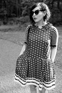 |
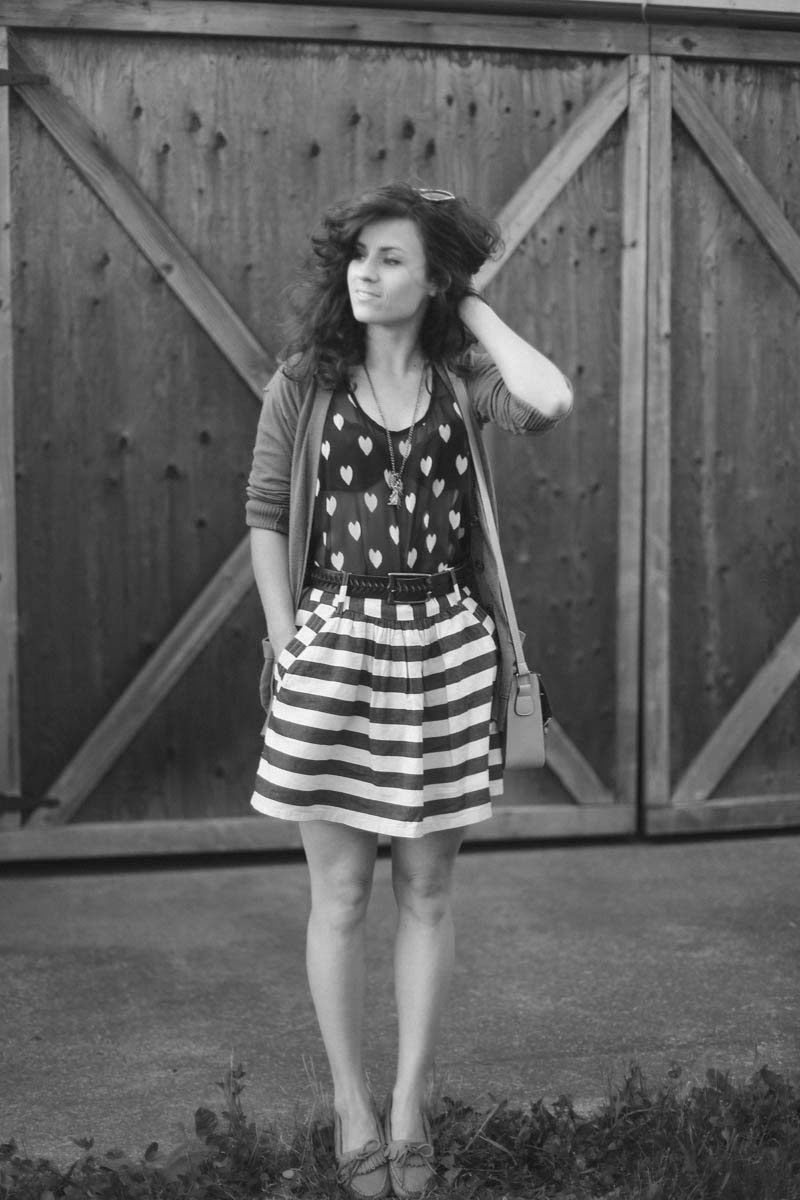
Liz of Delightfully Tacky takes this idea one step further by instead using hearts as a neutral pattern. These are neutral because they are very similar to polka dots. Generally, any repeating pattern could be considered a neutral pattern. Also since both of these patterns are the same height, one doesn't outshine the other. If the hearts were smaller, then the stripes would be the focal point, and vice versa, which certainly isn't a bad thing.
Size of the pattern does play a part, and I've always heard that you shouldn't mix two big, bold prints together, or two small prints together, but instead have one big pattern and one small pattern. A lot of time, however, I've found this not to be accurate. Patterns are similar to colors in that similar patterns often mix well, as well as opposite patterns. A good example of similar patterns mixing comes from Jana of Bekleidet. Both of these patterns are big, but they have a lot of similarities. They are both pretty geometric, with circles and straight lines. In fact, the lines and circles in the pattern on the bag play off of the neutral stripe and polka dot idea. That's the great thing about patterns, most of them link back to their hue, if you will, of stripes or dots. And that's the reason every print works with every other print--because of its origin (where people go wrong is with the color of the prints, but we will discuss that tomorrow). You may also notice that her boots have a pattern on them. Even though this isn't a fabric print, it still affects the overall look. But because the pattern also has geometric lines like the other two, it works well for the entire outfit. | 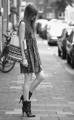 |
 | Ali of The Drawing Mannequin shows how a neutral print on her socks works with the big print of her dress. The pattern on her shoes also works because the organic shape matches that of her dress. Olivia of La Voyageuse utilizes the lace texture of her shirt to act as a print alongside the neutral polka dots on her pants. | 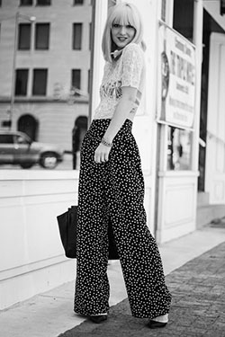 |
 | In my own outfit, I have a leopard print shirt, a floral dress (as a skirt), as well as polka dot tights. Floral is an organic print as well as animal prints, so they both work well together. Also, and I will give more examples of this tomorrow, since my leopard print shirt is in a neutral color, it automatically goes with my floral print. While it is necessary to look at the patterns in black and white to see how they respond to one another, if every print were in black and white, no one would have trouble mixing them. It's because of the color that gets people hung up.
|
I do realize that this post basically gave no help because I said that all prints go with all prints, but as far as I know it's true. If you have any questions about this post or anything about mixing prints, please don't hesitate to contact me! I would even be more than willing to help you pair prints together in your own outfits and give advice where I can.
Tomorrow we will be looking at how color affects prints, which will be like the finishing touch on this post. I'm also going to talk a little bit about different types of fabric and how that affects outfits as well, so stay tuned!
Have a great day. :)